Dry Point
|
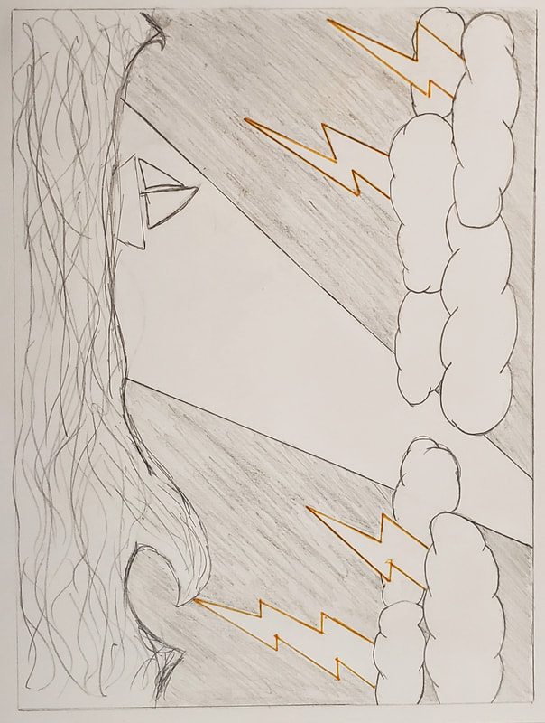
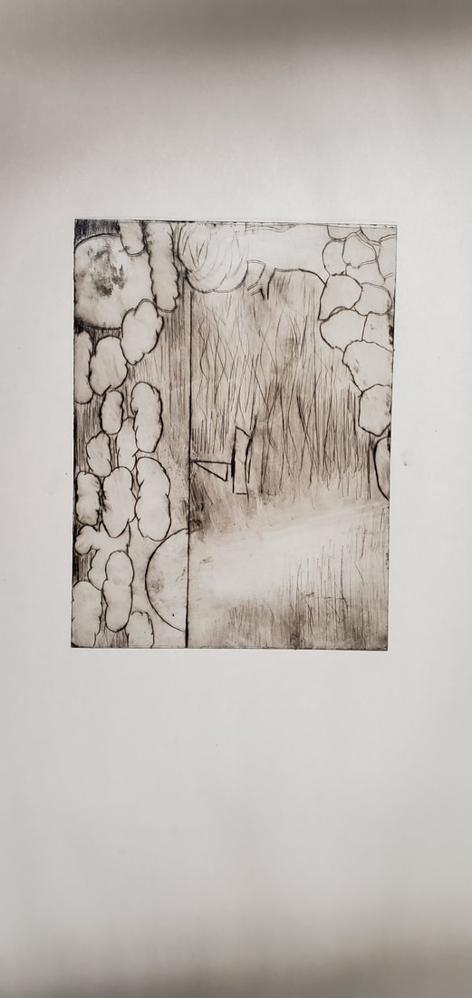
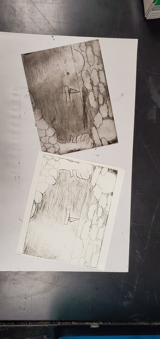
The Spot Between the Sun & the MoonDry Point & Water Paper
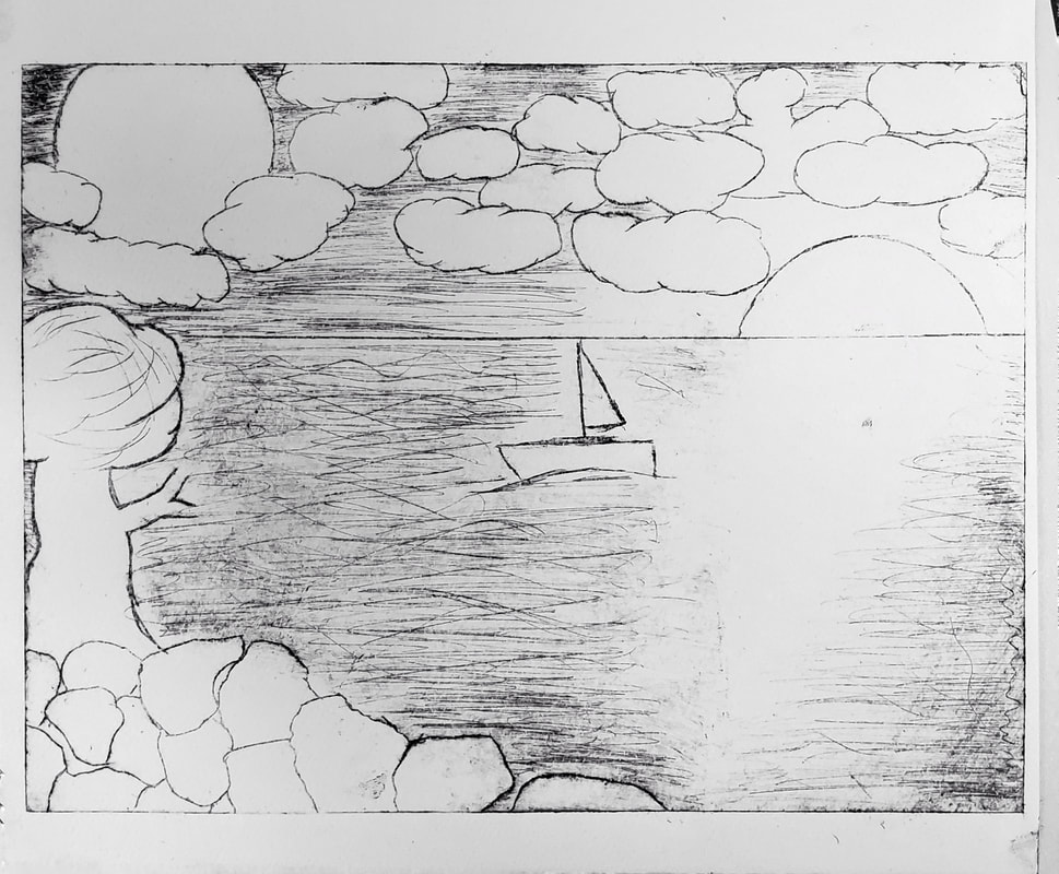
October 2019 18cm x 13cm Exhibition Text:The sun is meant to represent the light of the world that gives us day, or the light in the world that lets us truly see. On the contrary, the moon is meant to be the last little light we have even in the middle of all the darkness of the night. A time where you felt alone, even if there's someone next to you on the same boat, seems like there's no one for miles. You need to figure out if the sun is too far away, and is it time to look for the next light that comes in hope that it can lead you out.
|
The Process:
Inspirations
|
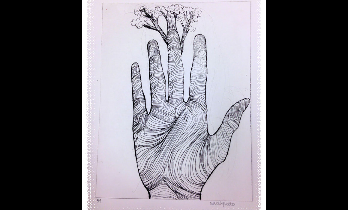
What I get from this picture is that Earth can only grow if we allow it to. The earth needs us in order to grow, similarly as to how we as humans need the earth as our home, food source, and basically everything else.
|
|
|
I liked this piece because I saw it as if the girl in the picture is in a way trying to connect with the earth. She sticks out her hand and feels the water. She isn't just splashing and playing with it, she is genuinely feeling the current and the methods the water moves by adding pressure as well as releasing some.
|

|
|
The biggest factor I liked about this piece was the way the artist was able to shade in the background and the sky. To me, I am able to see the wind, as well as depth. This amazed me because I didn't think it was possible to shade in this detail. After examining this piece, I wanted to work towards getting a similar amount of detail and shading. I wanted to try to get a similar amount of shading and depth to potentially make my piece like more than 2D. I wanted it to stand out.
|

|
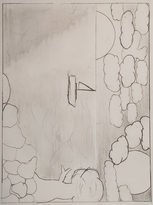
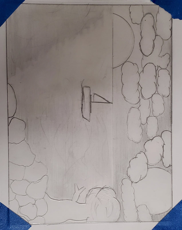
Planning Sketches
With this piece, I thought I would have most success with a nature piece. I wanted to make something either in the ocean in the middle of no where, or another tree similar to my last piece, While making the pieces, I wanted to give a message to either give hope, or wake people up and see whats going on.
|
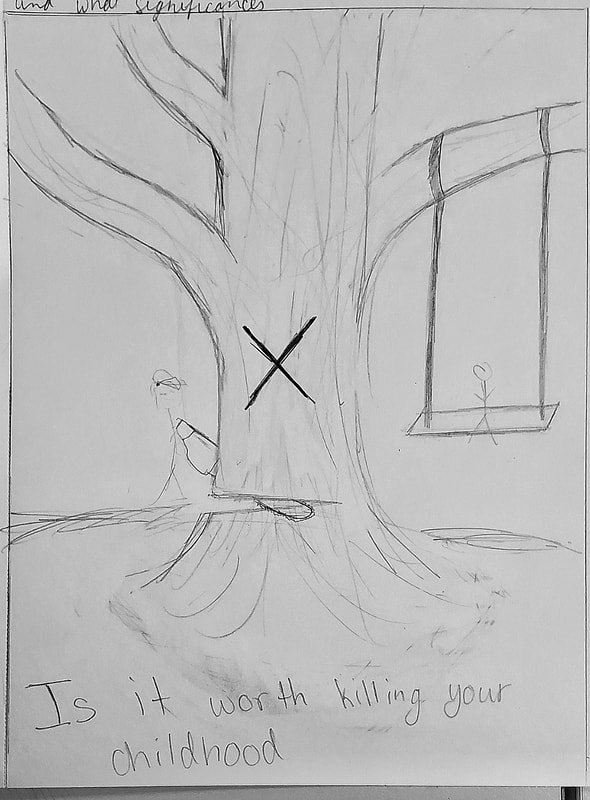
This was my 1st planning sketch. As seen in the picture, the message I had behind this piece was asking, "Is it Worth Killing YOUR Childhood". Something that I see more and more , are people hurting the environment. For example, a current problem is the burning of the Amazon forest. People all around the world decide their actions based on what will help them in the present time, but people don't often think about the impact a single action can make. 1 full mature tree can make enough oxygen for up to 18 people. The kid on the swing is meant to represent the young population of this world, as well as the old childhoods of those causing these problems today. The guy with the chainsaw isn't just cutting away at his childhood memories of swinging on a tree, but he is also taking away the oxygen of 18 people , one of which could be him himself. Now in days, I feel as if everything is revolved around money and just living while you can. I've heard people say, "Why should I care about the world? I'll be dead by then." I just think that many people have this ideology, and this is the reason to many of our problems. To me this piece relates mainly with my 1st inspiration of the tree in the hand. The earth needs us to live, just like we need the earth, but that doesn't work if we continue to do what we're currently doing.
|
|
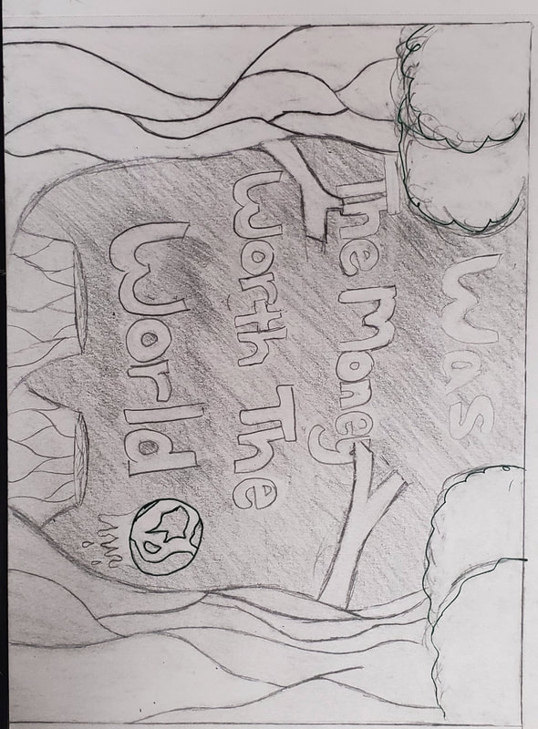
Similarly to the 1st planning sketch, I wanted to spread a message within the piece. A message that would relate on possibly a global aspect. My message in this piece says, "Was the Money Worth the Earth" and I even included a globe that is melting away. The sketch itself that I chose for this planning sketch is two full trees, as well as two tress cut down. The idea behind this is to spread the message that we are burning and destroying our planet. It seems as tho people think all our trees and natural resources will grow back at the rate in which we use them, but unfortunately, it doesn't work that way.
|
|
|
This piece was meant to symbolize how a little bit of light even in the heaviest of storms can make everything a little better. It shows a sail boat being pushed around in the crazy uncontrollable currents, that to me represented the ups and downs we have in life. Sail boats also only rely on wind power, so this was meant to represent that sometimes you just have to go with the wind and current to find your way.
|
|
The only real reason I chose this one instead of the 3rd, was I just simply felt more drawn to and connected with this piece. It made more sense to me and just felt right to me. This was the piece I felt I needed to make in order to be satisfied. The message in this piece is simply find your light. Whether you're right there in the day, or if you've drifted off to far into the night, no matter how dark it becomes, you can always find yourself a little bit of light. Sometimes you may be filled with warmth and energy. Maybe that's when you're right by the sun. And then there may be times when you feel all alone in the middle of the night, but no matter where you go, there will always be a light looking over you. That's what I believe is the thing you have to look for within every situation. Find the light. Find your way.
|
|
Process
1. First I had to plan everything out to figure out what style a theme I wanted to aim for. From the beginning, I knew I either wanted to do something related to trees, similarly to my block print, or something related to being at sea. My inspiration and theme for this piece was the idea of finding your way, as well as incorporating nature. My biggest theme has always been nature and landscapes. It just seems so pure and natural to me. Something we could never replicate. I then created four sketches, two of a tree and two at sea, and chose the one that I personally felt the most. I then used this piece as the template for my dry point.
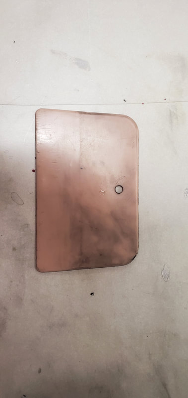
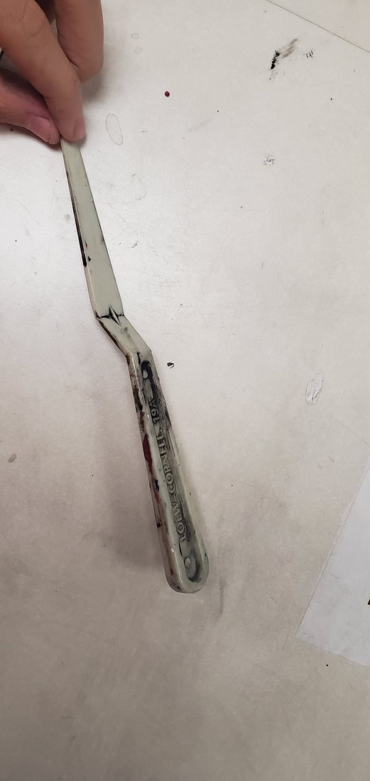
2. The first thing I did when starting to copy over my sketch to the plastic was lay my plastic plate over my sketch, tape it down so that it wouldn't move, and then begin to scratch away at the plastic. It was like tracing over my sketch, but i was using a dry point inscribing tool provided by my teacher. This tool allowed me to scratch away the plastic where the ink would later fall into. The was the basic process of inscribing my image into my plastic.
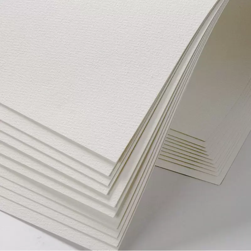
3. I then gathered all of the materials I would be using to ink and transfer my image onto my water paper. These materials included:
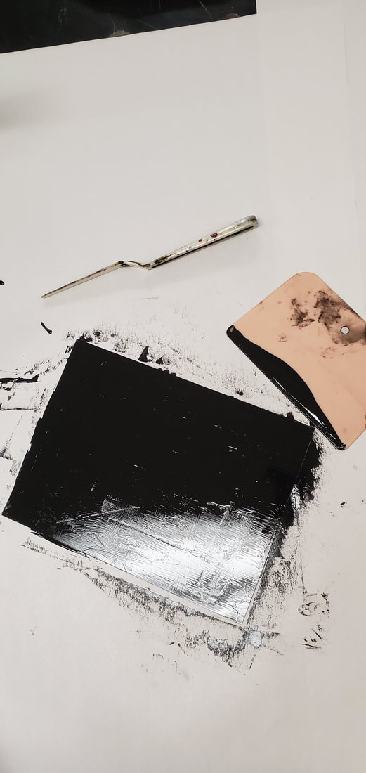
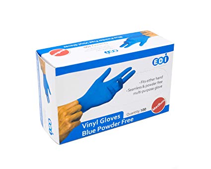
my plastic plate, oil based ink, a bucket with water, watercolor paper, a towel, a pallet knife, plastic scraper, and gloves.
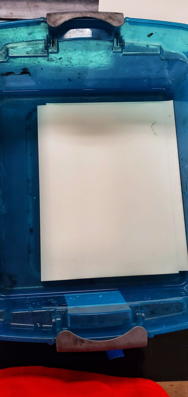
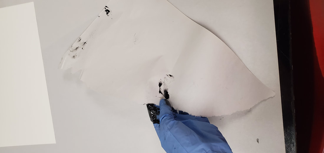
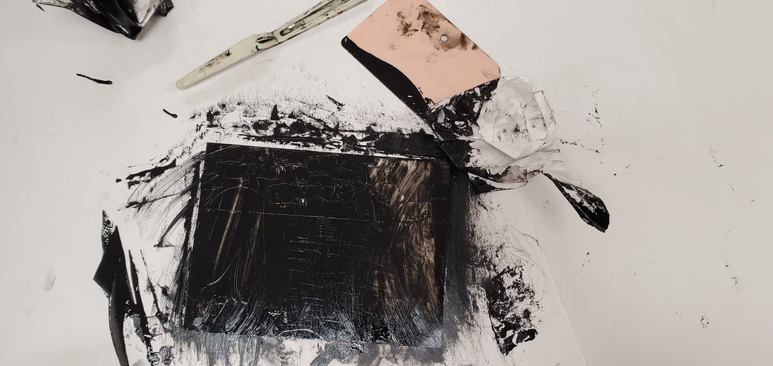
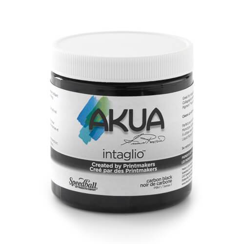
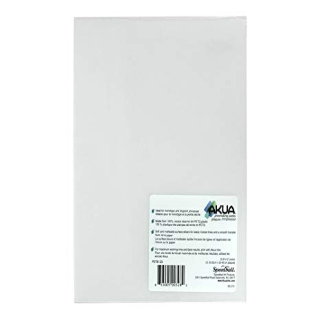
4. I started off my getting my watercolor paper ready by soaking it in the bucket of water for 8-10 min. During these 8-10 min, I worked on inking my inscribed piece of plastic. I started off by getting my gloves and my black oil based ink. I used a pallet knife to gather a small amount of ink. This ink goes a very long way, so I can just add more if i need more, but it is better to start off with a little amount. Once I had the ink on the plastic, I used the plastic scraper to scrape ink through out the plastic sheet. Scrapping all this ink around allows for it to fall into all the cracks that were inscribed with my tool. The scrapper also allowed me to take of any extra pools of ink. Once I thought all my cracks were filled and I had taken off as much ink as I thought I could, I then used a piece of scratch paper to remove the excess ink that my scrapper couldn't take off. I did this by crumbling up my paper and an scrubbing off the extra ink in the places I felt it was unnecessary. After my plastic was all inked and ready, I took out my paper from the water, let it dry completely flat in a towel, and began the process of letting my inked image transfer over to my paper.
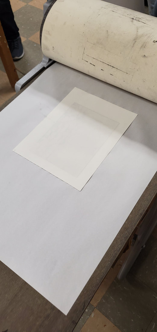
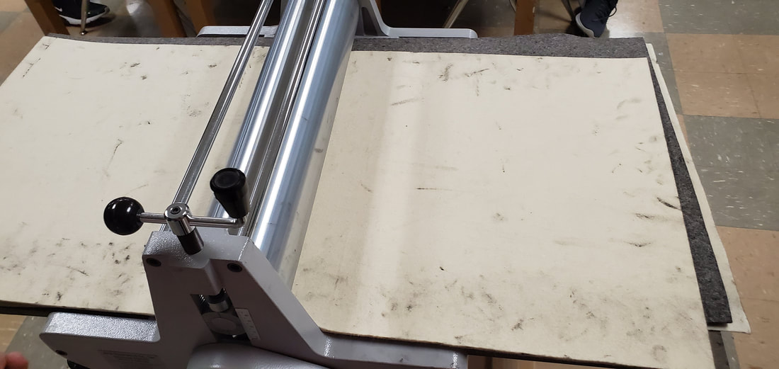
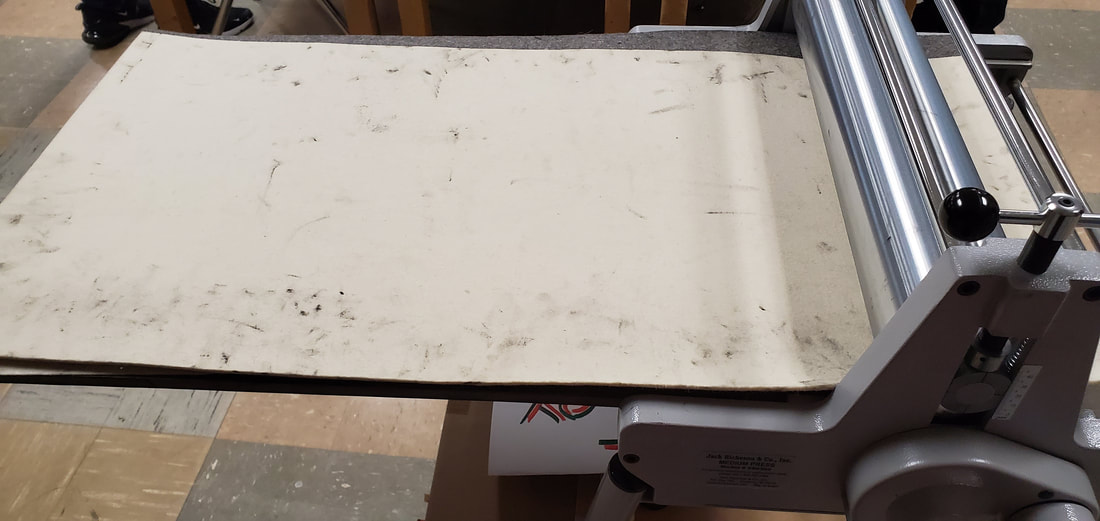
For this process, I lined up my watercolor paper as best as I could and laid it square on top of my inked plastic sheet. When my paper was all lined up, I ran it through the takach roller that we have in class. The roller applied enough pressure onto my paper and sheet to squish the wet paper into every little crack to get all the ink and transfer the image.
2. The first thing I did when starting to copy over my sketch to the plastic was lay my plastic plate over my sketch, tape it down so that it wouldn't move, and then begin to scratch away at the plastic. It was like tracing over my sketch, but i was using a dry point inscribing tool provided by my teacher. This tool allowed me to scratch away the plastic where the ink would later fall into. The was the basic process of inscribing my image into my plastic.
3. I then gathered all of the materials I would be using to ink and transfer my image onto my water paper. These materials included:
my plastic plate, oil based ink, a bucket with water, watercolor paper, a towel, a pallet knife, plastic scraper, and gloves.
4. I started off my getting my watercolor paper ready by soaking it in the bucket of water for 8-10 min. During these 8-10 min, I worked on inking my inscribed piece of plastic. I started off by getting my gloves and my black oil based ink. I used a pallet knife to gather a small amount of ink. This ink goes a very long way, so I can just add more if i need more, but it is better to start off with a little amount. Once I had the ink on the plastic, I used the plastic scraper to scrape ink through out the plastic sheet. Scrapping all this ink around allows for it to fall into all the cracks that were inscribed with my tool. The scrapper also allowed me to take of any extra pools of ink. Once I thought all my cracks were filled and I had taken off as much ink as I thought I could, I then used a piece of scratch paper to remove the excess ink that my scrapper couldn't take off. I did this by crumbling up my paper and an scrubbing off the extra ink in the places I felt it was unnecessary. After my plastic was all inked and ready, I took out my paper from the water, let it dry completely flat in a towel, and began the process of letting my inked image transfer over to my paper.
For this process, I lined up my watercolor paper as best as I could and laid it square on top of my inked plastic sheet. When my paper was all lined up, I ran it through the takach roller that we have in class. The roller applied enough pressure onto my paper and sheet to squish the wet paper into every little crack to get all the ink and transfer the image.
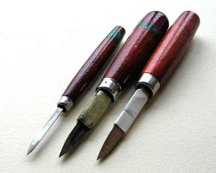
Tools and Techniques
Tools1. Inscribing tool
2. Scrapper 3. Bucket of Water 4. Oil-Based ink 5. Plastic plate 6. Watercolor paper 7. Towel 8. Pallet knife 9. Gloves 10. Takach Roller |
|

Techniques
My techniques on this project were pretty simple. For the shading, I tried shading how I would with a pencil on paper. The I started using crosshatching to shade the darkest areas in the corners. For everything else, my techniques varied a lot as I did more and more prints. I would see which helped, which didn't, and then I would try to use the best ones on my final prints. One technique I used was taking off as much as I could using the scrapper. This made it so that there was less ink I had to rub off with the pieces of newsprint. This helped shorten the process time, but also didn't always help because there were a few times when I took off too much ink, so then I would have to go back and add a bit more. I had two different methods in the way I would use the news print to remove extra ink, I was try to rub it off first in large strokes to remove larger amounts, but then when doing more detailed areas, I would do smaller circular strokes to remove smaller amounts for more details. Later on, I realized I wasn't very happy with how light my 1st prints were coming out, so I decided to fold the piece of newsprint that goes under my plastic and the watercolor paper as it goes through the takach roller. I figured this would give it a little more height which would then allow there to be more pressure under the rolling pin and in theory push the paper farther into the carving to get more ink and come out as darker.
Reflection
I feel like the biggest key factor that I messed up on was time management. I've learned that I need to have a good sense of time management, because I never know what problems I may encounter while making the project. I feel as if I pushed this project off a bit, and in doing so, I feel like I had a more basic dry point. I didn't add color or really get to experiment with different shading, so overall, I wish I could've done that different. Besides that, I feel like it was an overall success. I'm proud of my work, and I got a result that was pretty close to what I envisioned for this project. I think what took the longest was deciding which aspects and what type of piece I wanted to do. I think my final piece tied in well with my inspirations, some more than others.
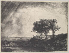 Rembrandt, The Tree Trees, Etching with Drypoint and Engraving, 1643 Rembrandt, The Tree Trees, Etching with Drypoint and Engraving, 1643
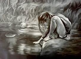
Dafne Di Marco, the girl in the pond, Conte on paper
|
Compare and ContrastCompare:
-Both have shaded back grounds -Connected to nature -No use of colors Contrast:
-Mine has more of the sea/lake rather than a pond -Unlike the girl in the pond, there isn't a person or figure anywhere in my piece |
|
ACT Responses
Clearly explain how you are able to identify the cause and effect relationship between your inspiration and its effect on your artwork?
My inspirations had a big influence on the way I shaded in the background areas as well as the things I included in my piece. I tried to incorporate at least one thing fro each inspiration, for example the water from the pond, the tree from the hand growing into a tree, and then the shadowing and lighting effects of Rembrandt's three trees.
What is the overall approach the author has regarding your topic?
Regarding my topic, the author's of these pieces make me feel a sense of one within nature. They make me feel as if I was connected to nature as I could put myself in the spot of that girl and feel the water, or if I had taken a picture of those three trees, or as if the nature around me was growing as a part of me.
What kind of generalizations and conclusions have you discovered about people, ideas, cultures, etc. while researching inspiration?
While researching for my piece, I found many different styles people use for drypoint, but the biggest think I noticed is that most people do drypoint based on people. I personally don't like drawing people, and was surprised to see that of all things people could sketch, most involved a person. I was also surprised that they were mainly either side shots of the person or the person was staring directly to you and was usually pretty close up.
What was the central theme or idea around your inspirational research?
The central theme behind my piece was originally to have a visible message in the piece bringing light to a global problem against nature, but by the time I was happy with a sketch, I wanted to portray a message that was a bit more personal to me. It was about being stuck between the light/good path, and a dark/bad path, but no matter what path you take, you can always find a little bit of light even in the darkest situations.
What kind of inferences did you make while reading your research?
The inferences I made where what the artist was trying to portray to his audience in each piece. I also had to think about what techniques would maybe worked better than others for the type of application I wanted to do.
Bibliography
Clare Tapia, http://cargocollective.com/claretapia/filter/printmaking/Drypoint-Etching.
Chelsea Magazine Company. “5 Essential Tools for Drypoint.” Artists & Illustrators Magazine, https://www.artistsandillustrators.co.uk/how-to/printmaking/1961/5-essential-tools-for-drypoint.
“The Three Trees.” Metmuseum.org, https://www.metmuseum.org/toah/works-of-art/29.107.31/.
Chelsea Magazine Company. “A Beginner's Guide to Drypoint.” Artists & Illustrators Magazine, https://www.artistsandillustrators.co.uk/how-to/drawing/228/a-beginners-guide-to-drypoint.
Dietzen, N.A. “The Girl in the Pond Drawing by DAFNE DI MARCO (Australia): Artmajeur.” Artmajeur Online Art Gallery, 5 Sept. 2017, https://www.artmajeur.com/en/dafne-di-marco/artworks/10268554/the-girl-in-the-pond.
